 The red line represents the percent of the civilian workforce that has been unemployed for half-a-year or more.
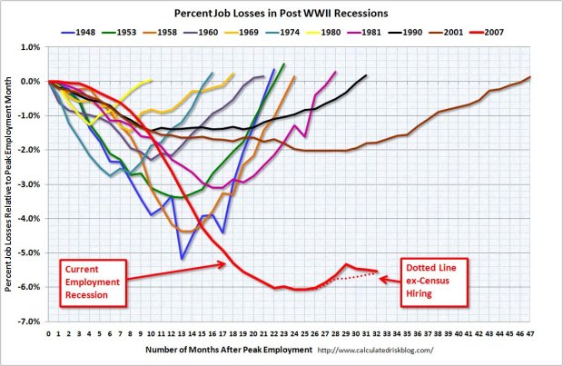 This chart represents the percent of jobs lost since peak employment was reached. The dashed line is supposed to compensate for Bureau of Census "make-work" jobs.
Now, let's examine these charts using an electron microscope.
 Check it out: I tagged the Summer o' Recovery! They're celebrating in the tent cities!
 Now, let's review the change in employment from peak employment. This should be rising and... oh. Hmmm. Oops.
My bad.
Không có nhận xét nào:
Đăng nhận xét