Phishing: How Banks can Fight Back
 True to yesterday's promise, here are several suggestions for banks to more effectively combat the scourge of phishing. If you're unfamiliar with the 'phishing' concept, please refer to this primer. In short, phishing emails claim to be from a reputable financial website and encourage the victim to sign-in. The phisher puts up a false "store-front" that appears to be the real financial website and then captures the victim's sign-in data. The phisher then uses the victim's sign-in for a variety of nefarious purposes including theft of funds, identity theft, etc.
Yesterday's post discussed the pros and cons of Bank of America's new SiteKey anti-fraud measures. I gave BofA a C on their report card, primarily because their countermeasures could be spoofed by a false store-front smart enough to proxy the user's transactions.
In other words, BofA's SiteKey could be effectively defeated by a false store-front that accepted the user's log-in data, proxied it to the real site, and then presented the real site's page and images back to the user as if it were genuine.
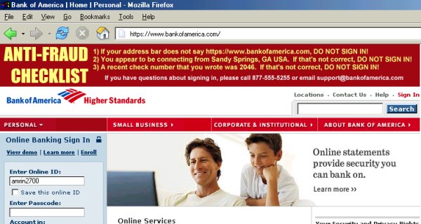
Pictured above is how I think BofA's website should appear to the end-user. Note the topmost banner, which is a dynamically generated image. It consists of a checklist that users should read before signing in. I suspect most users would actually check this out due to its prominence on the page.
Here's how it works. The user would enter an online ID (user name) on the initial screen - there would be no password, PIN, or other truly 'secret' data entered on the first page. The screen pictured above would be the second page of the sign-in. The anti-fraud checklist on the topmost banner consists of three items. Let's review each.

1) The first line reads If your address bar does not read https://www.bankofamerica.com DO NOT SIGN IN. The address in the address bar -- the simplest anti-fraud measure -- is seldom noted on financial websites. It's the most crucial element in combatting phishing. If the address bar doesn't match up... don't sign in! It's... just... that... simple.
2) The second line reads You appear to be signed in from Sandy Springs, GA USA. If that's not correct DO NOT SIGN IN. The physical location that the customer appears to be connecting from can be deduced (in most cases) from the customer's IP address. A geographic IP address location algorithm can be used to generate this sentence. This prevents a false store-front from acting as a proxy (a false store-front brokering requests to the real site would yield a different geographic location in Taiwan, Russia, etc.). A false store-front would therefore have to compute this information itself and paste it into a dynamically created image 'on the fly'. Do-able, but considerably more difficult.
3) The third line reads A recent check number that you wrote was 2046. If that's not correct DO NOT SIGN IN. A shared secret (in this case, a recent check number) is used to further authenticate the genuine site to the user. The bank will have the customer's recently cleared check numbers. The phisher won't.
Yes, a dedicated and tech-savvy phisher could construct a false store-front that proxies the initial sign-in page, grabs the resulting JPEG, looks up the geographic location from the IP address, pastes that in (while matching fonts)
But critical to this checklist is the fact that the typeface (font face) is chosen randomly. Now, the typeface will be consistent for the three items on each banner, but the typeface will vary randomly for each sign-in. Thus, if the false store-front goes to the trouble of painstakingly constructing the checklist itself, it will also have to match fonts to stick the correct location into the image.
The randomly selected typeface makes cutting and pasting text from the dynamically created image considerably -- considerably -- more difficult for the phisher! And interspersing a shared secret (the check number) ensures that the false store-front must (a) proxy the transaction, (b) compute the victim's real geographic location; and (c) match typefaces correctly in order to make the false storefront realistic.
That's quite a task.
Thus, we've turned the sign-in process into a bit of a captcha problem for phishers. I don't think this approach would be easy for the bad guys to defeat... but feel free to poke holes in this strategy, using the comments link.
Không có nhận xét nào:
Đăng nhận xét